
Construction company
FELCO Construction
A construction company website presents three service areas, two project galleries and enquiries by form or phone.
Visit the website ↗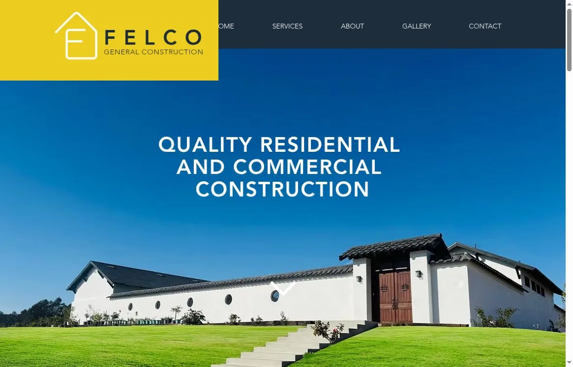
Context
FELCO General Construction works on residential and commercial projects in California. The site presents preconstruction planning, remodelling and project management. For an offer like this it is not enough to list services — the site also has to show the kind of buildings the company works on.
The challenge
Pair a clear explanation of the services with visual examples of the work. Visitors should recognise their type of project, see relevant buildings and find a way to discuss it. The long homepage works as a step-by-step introduction to the company, with detailed galleries on separate pages.
What we did
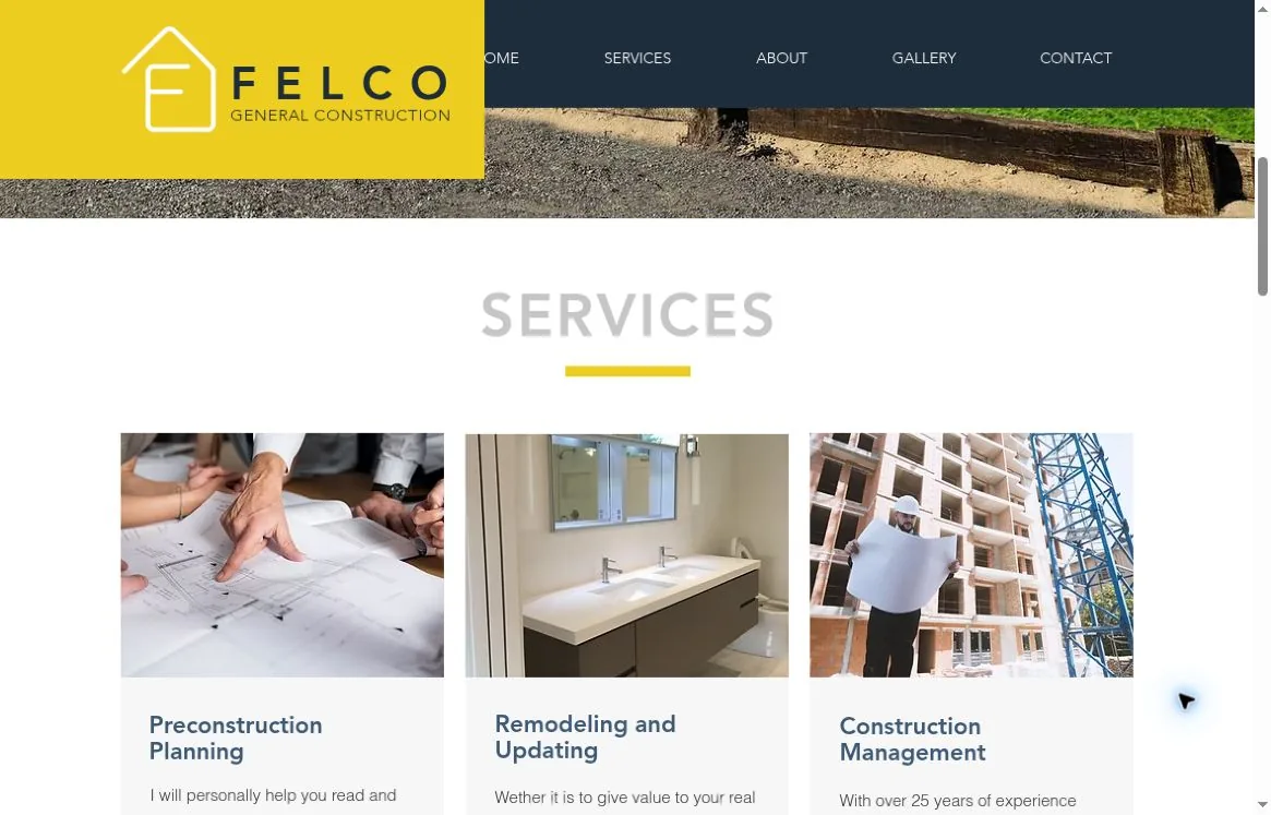
Three service lines
Preconstruction Planning, Remodeling and Updating, and Construction Management each get their own card. A photo, a title and a short explanation make it easy to tell planning, renovation and construction management apart.
Architecture front and centre
A large photo of a finished building backs up the core message about residential and commercial construction. The headline sits over the image, so visitors see both the line of work and its subject at once.
Two separate portfolios
The gallery is split into Residential Construction and Commercial Construction. Different building types never mix: visitors pick the relevant area and go to its own selection.
From introduction to enquiry
The homepage moves through services, company, gallery and contacts, and the menu jumps straight to each block. At the end there is a form, a phone number and an offer to discuss a project estimate.
What we built
Visual system
A yellow brand block stands out against dark navigation and white content sections. Photos of buildings and construction work take up large areas. Yellow rules under the headings echo the logo accent and pull varied material into one system.
#EDCD1F#1E2D3B#3B3A3A#F7F7F7#FFFFFFInterface typography
The sizes below were measured on the live site at a 1180 × 757 CSS px viewport, 100% zoom, DPR 1. They describe that specific layout, not fixed sizes for every device.
- Headings
- Avenir LT Heavy · separate weight file; CSS weight 400
- First-screen headline
- 42 px / 46.2 px · tracking 2.1 px (0.05em)
- Service titles
- 22 px / 24.2 px · Avenir LT Heavy
- Body text
- Helvetica Light · 15 px / 24 px · CSS weight 400
- Navigation
- Avenir LT Light · 14 px / 37 px
- Section headings
- 55 px · Avenir LT Heavy · line-height: normal
Logo and usage
The brand block on the site is a composite: a house symbol with the letter F and separately set FELCO / GENERAL CONSTRUCTION lettering. Below is a real fragment of the header, so the original letterforms and spacing are kept.
- Symbol image
- 116 × 116 px · 1:1 square
- Symbol size on the site
- 116 × 116 CSS px at a 1180 × 757 viewport
- FELCO lettering
- Text block 220 × 42 CSS px; type 42 px / 42 px; tracking 2.1 px
- GENERAL CONSTRUCTION line
- Text block 220 × 16.5 CSS px; type 15 px / 16.5 px; tracking 0.75 px
Colour values were checked against the site’s CSS. Type samples are shown as fragments of real screens; commercial font files are not included in this case study.
Journeys and material
First screen → the right service → residential or commercial gallery → Contact. Visitors can read the homepage top to bottom or jump straight to a section from the menu. Separate galleries let people browse the work without overloading the main page.
Promotion
We optimised the site for search, set up a Google Ads account, and launched advertising and search promotion.
The result
A corporate site is live, presenting the construction services step by step with separate project galleries. Services, company information and contact points form one clear route; real photos give the offer visual context.