
Tool distributor
Magniflora
A Portuguese distributor website brings six brands, news, subscription and contact into one visual system.
Visit the website ↗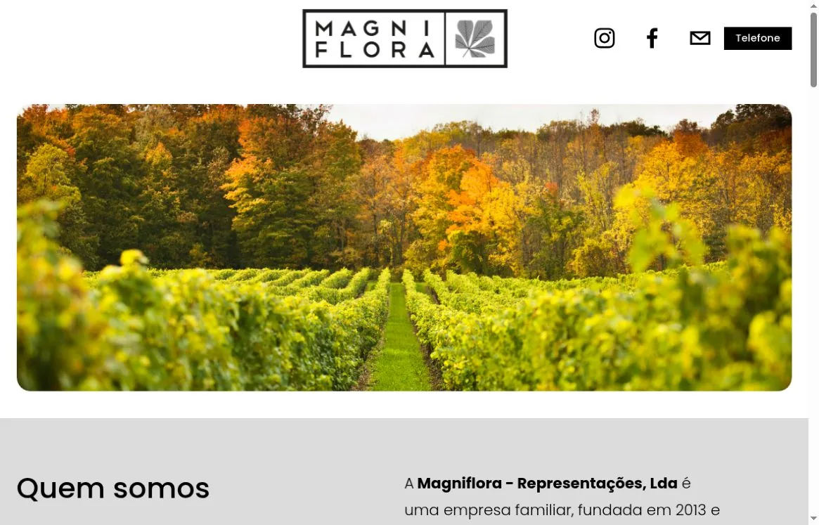
Context
Magniflora represents and distributes tools for farming, gardening and leisure in Portugal. Because the company works with several brands, the site has to explain the distributor’s role while keeping each manufacturer recognisable.
The challenge
Bring different brands together into one clear showcase. Visitors should see what Magniflora does, find the brand they need, go to the manufacturer’s information or contact the company. The site deliberately avoids the weight of an online shop: its job is to present the range and connect visitors with the right source.
What we did
The company before the brand list
The page opens with a nature photo and a short Quem somos block. It sets the farming and gardening context, then explains whom Magniflora represents and where the company operates.
An even-handed brand showcase
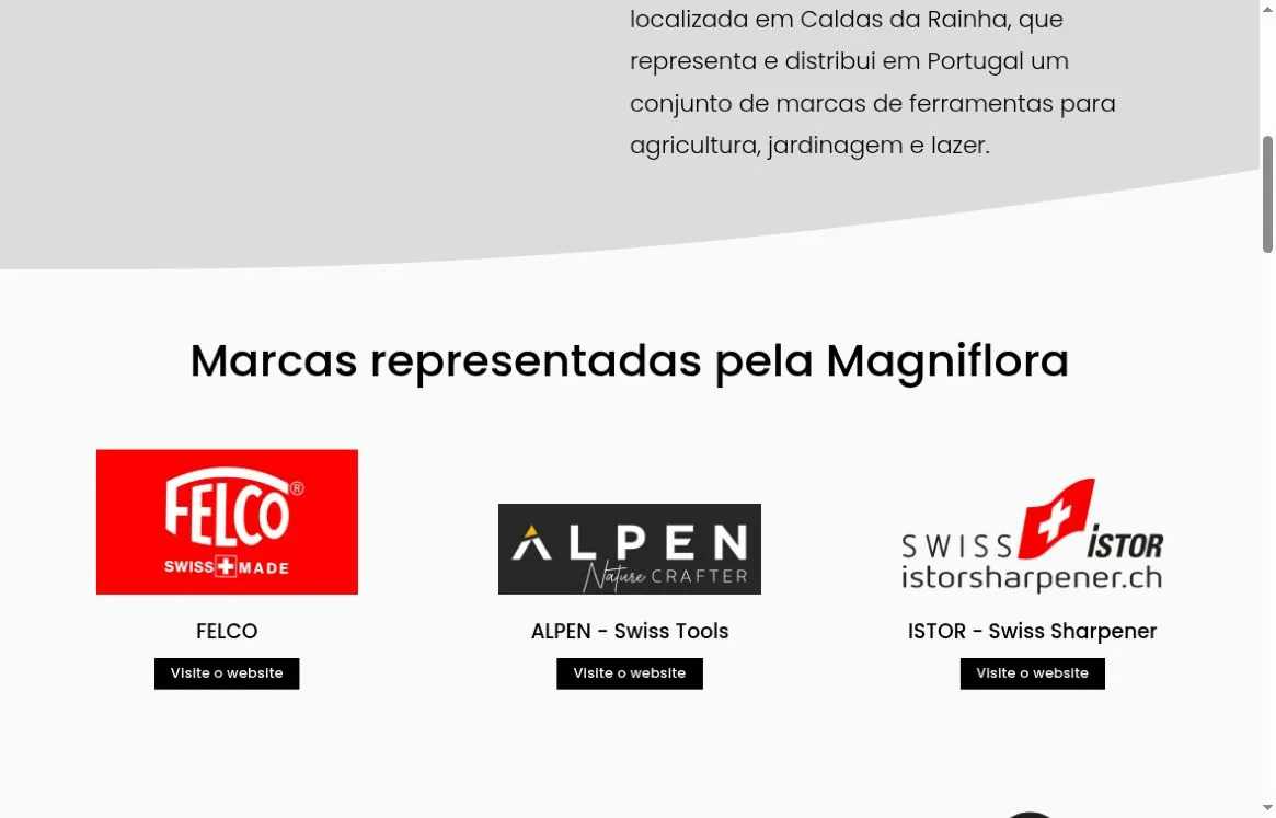
FELCO, ALPEN, ISTOR, SWIZA, EXBANOR and MESTO appear in repeating blocks. A logo, a name and a link to the manufacturer’s site give each brand its own place while keeping one rhythm across the page.
The next step without extra screens
Finding a FELCO retailer has its own prominent link. Contacts sit at the top of the page, while a detailed form and company information close the journey.
News as an extension of the range
A news carousel shows product updates and leads to the details. A newsletter sign-up and social links let people keep following the brands after their first visit.
What we built
Visual system
Neutral white and grey surfaces never compete with the manufacturers’ logos. Black buttons and text make the navigation clear. A large nature photo brings in colour and links the tools to where they are used; soft shapes and generous spacing keep the presentation calm.
#DCDCDC#1C1C1C#FFFFFF#000000#FAFAFAInterface typography
The sizes below were measured on the live site at a 1180 × 757 CSS px viewport, 100% zoom, DPR 1. They describe that specific layout, not fixed sizes for every device.
- Typeface
- Poppins
- Quem somos heading
- 41.49 px / 53.90 px · 500
- Intro text
- 21.66 px / 39.00 px · 300
- Brand names
- 18.83 px / 24.47 px · 500
- Retailer locator heading
- 32.99 px / 43.97 px · 500
- Brands section title
- 41.49 px / 74.68 px · 500
Logo and usage
The logo combines two-line MAGNI FLORA lettering with a plant symbol inside a rectangular frame. On the site it is a single image, so the composition is kept whole, frame and inner spacing included.

- Logo file
- 1356 × 390 px · ratio 226:65 (≈ 3.48:1)
- Use in the header
- 295.47 × 84.98 CSS px at a 1180 × 757 viewport
- Composition
- Horizontal block, two-line name and plant symbol
Colour values were checked against the site’s CSS. Type samples are shown as fragments of real screens; commercial font files are not included in this case study.
Journeys and material
Meet Magniflora → pick a represented brand → the manufacturer’s site. FELCO buyers have their own route to retailers; direct questions go to phone, email and the contact form. News and the newsletter support the main journey without replacing it.
Promotion
We optimised the site for search, set up a Google Ads account, and launched advertising and search promotion.
The result
A single distributor website has been built and launched. It brings brands, news, useful links and contacts together on one coherent page in Portuguese. Each brand stays recognisable, and Magniflora remains the thread that ties the structure together.