
Industrial catalogue
Ravendo
An equipment manufacturer’s catalogue connects product selection, search, service information and dealers in English and Danish.
Visit the website ↗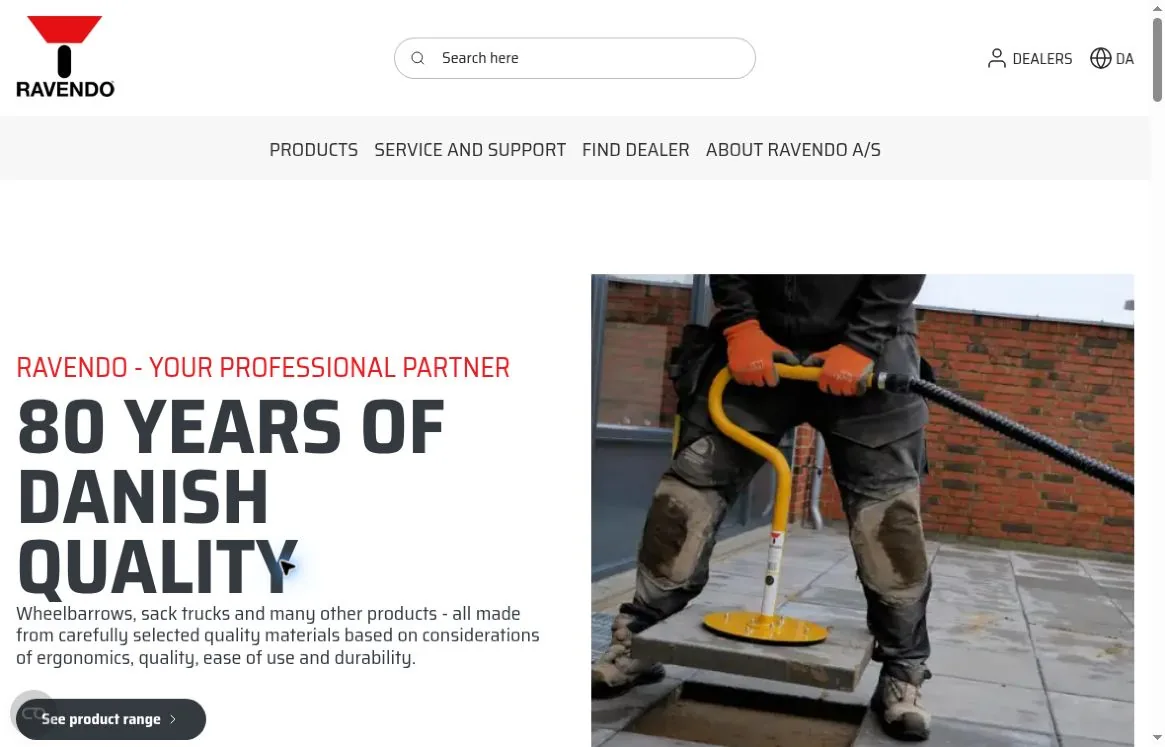
Context
Ravendo makes wheelbarrows, warehouse and transport trolleys, and equipment for moving materials. What matters here is not just how a product looks but what it is for, how easy it is to use and which model is the right fit. The site brings together an industrial range and information about the manufacturer, with separate ways in for buyers and professional partners.
The challenge
Present a large range as a system of working solutions. Visitors need to move quickly from a general picture of the company to an equipment category, then find details, support or a dealer — without the technical content getting lost behind brand imagery.
What we did
Product architecture
The main menu separates Products, Service and Support, Find Dealer and About Ravendo, with search at the top of the page. This order gives a direct path both to people who already know the product they want and to those still choosing a category.
Equipment in action
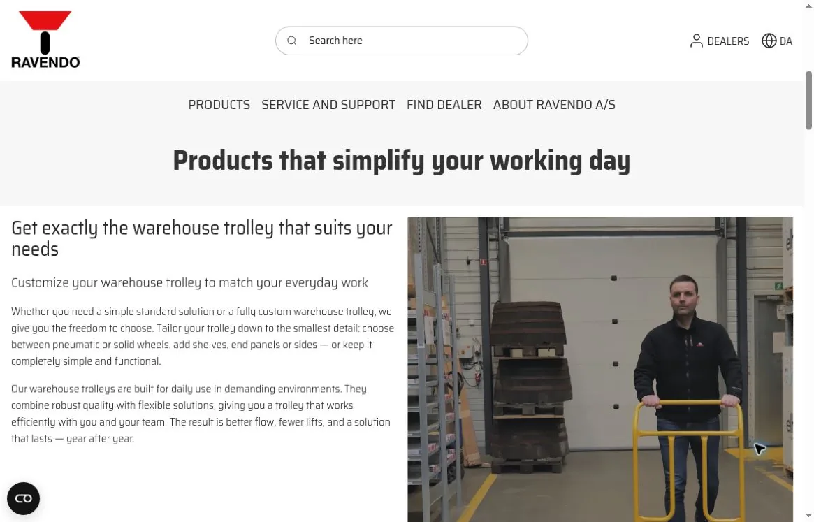
The first screen combines a large headline with equipment being used. Further blocks cover warehouse trolleys, board handling and ergonomics: each product is shown in the context of a real task.
Information for a professional choice
The range is backed up by material on quality, warranty, Danish manufacturing and custom solutions. Service information sits next to the product structure instead of being buried in the company story.
Different visitor routes
The catalogue, the dealer finder and a separate dealer login each solve a different task. English and Danish versions serve an international audience without changing the logic of the main sections.
What we built
Visual system
A white background leaves room for dense technical content and photography. A red accent ties the interface to the logo, and dark headings hold the hierarchy. Large condensed type makes the main message stand out, while calmer text blocks explain what the equipment is for.
#ED1C22#343A40#FFFFFF#F7F7F7#333333Interface typography
The sizes below were measured on the live site at a 1180 × 757 CSS px viewport, 100% zoom, DPR 1. They describe that specific layout, not fixed sizes for every device.
- Typeface
- Saira Semi Condensed
- H1
- 79.10 px / 71.19 px · 700
- Section heading
- 39.70 px / 35.73 px · 700
- Product block heading
- 27.88 px / 31.37 px · 400
- Lead
- 20 px / 30 px · 300
- Body text
- 16 px / 24 px · 300
Logo and usage
The vertical Ravendo mark: a red wheelbarrow shape, a black wheel and the name. The header uses a compact vertical version that reads well next to the search field.

- Logo file
- 150 × 129 px · ratio 50:43
- Use in the header
- 100 × 86 CSS px at a 1180 × 757 viewport
- Shape preserved
- Width and height scale together; the image is never stretched
Colour values were checked against the site’s CSS. Type samples are shown as fragments of real screens; commercial font files are not included in this case study.
Journeys and material
Home → Products → equipment category → product. Alternative routes: search across the range, Find Dealer to reach a seller, and Service and Support for after-sales help. On the homepage, demo material acts as extra entry points into specific areas.
Promotion
We optimised the site for search, set up a Google Ads account, and launched advertising and search promotion.
The result
The manufacturer’s site is live, bringing the range, product applications and service information into one system. It presents Ravendo on the international market and helps visitors go from getting to know the company to choosing specific equipment.